Client: Hamkorbank
Context: Re-Branding
Task: Our analysis revealed that the previous Hamkorbank logo created several challenges: — it was difficult to use across marketing and communication materials; — it lacked sufficient adaptability across different formats and platforms; — the bank did not have a comprehensive brand book, which limited its ability to communicate brand values to customers in a modern and engaging way. At the same time, the bank’s strategic plans included repositioning itself in the market, developing a broader product ecosystem, and transitioning to an updated brand platform. Together, these factors became the foundation for launching a comprehensive rebranding process.
Solution: Based on Hamkorbank’s mission and strategic positioning, we began the project with a redesign of the logo.
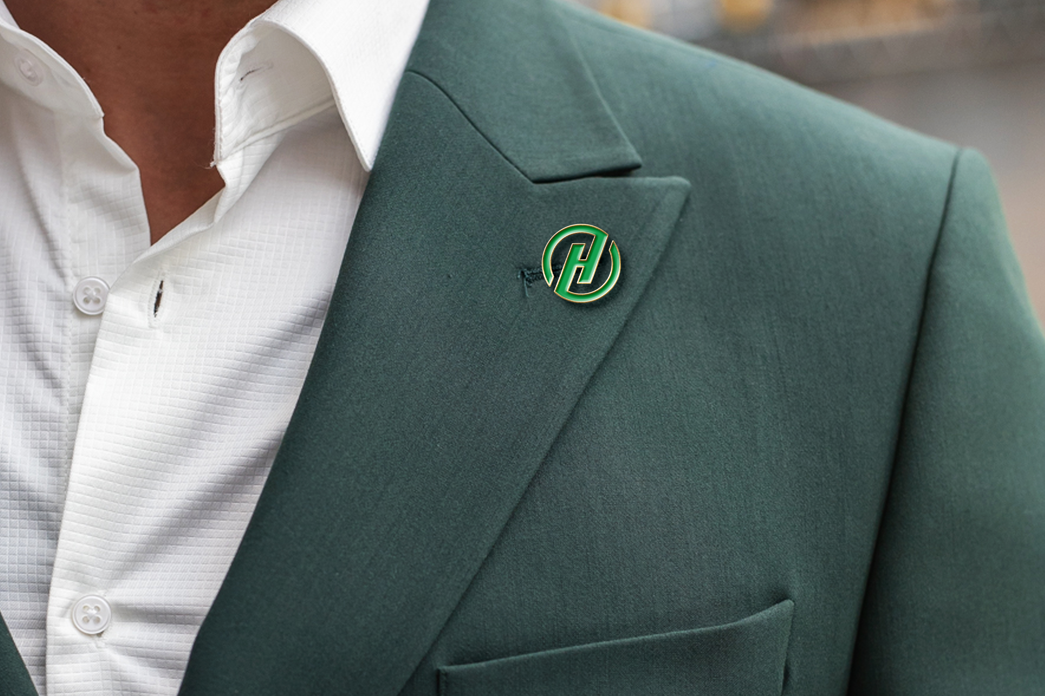
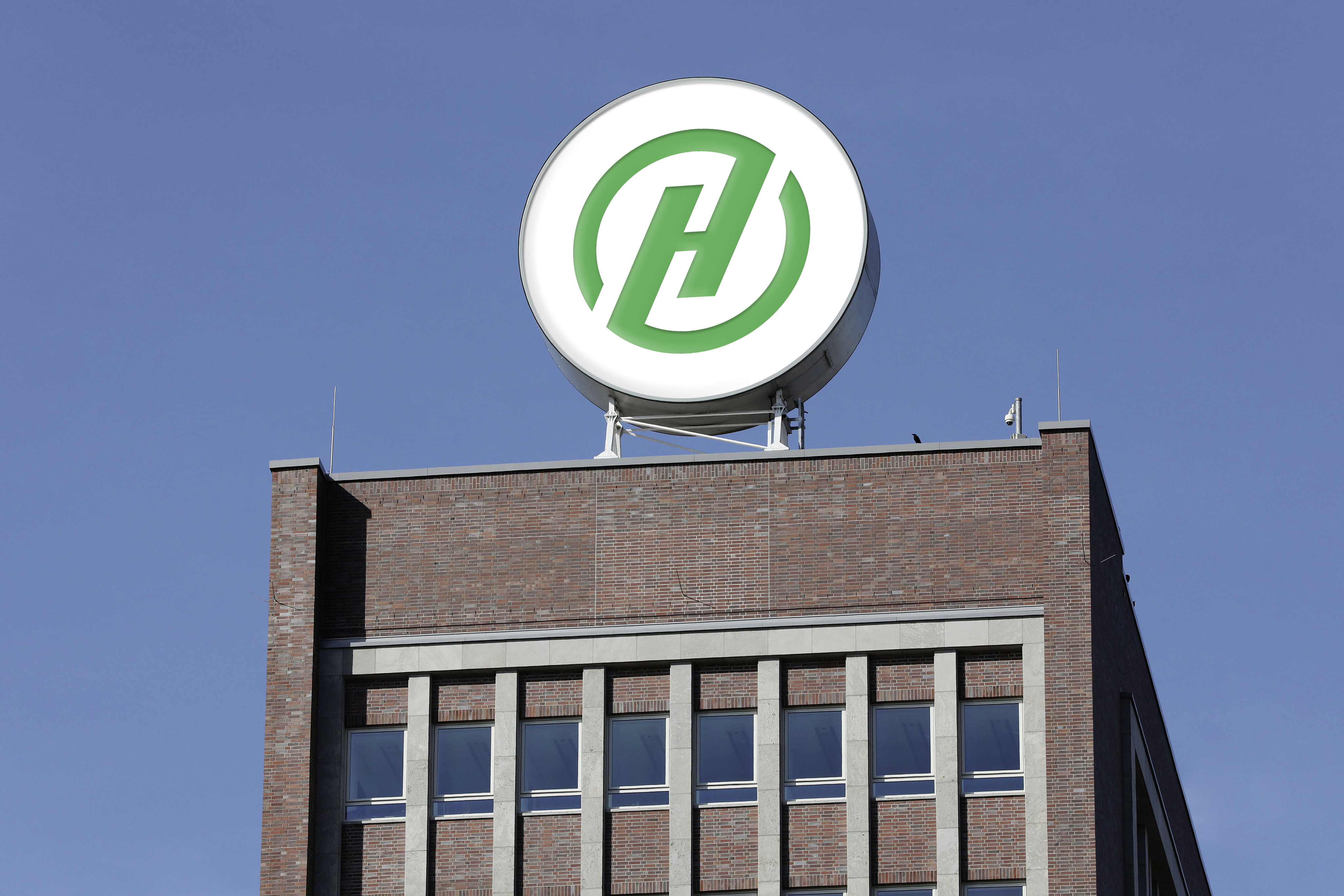
To preserve continuity and the brand’s existing recognition, we retained the letter “H” as the central element of the identity. It plays a key role in Hamkorbank’s brand recognition.
We developed several logo concepts while preserving the core idea. In collaboration with the bank’s team and leadership, a final hybrid solution was selected.
The new logo features:
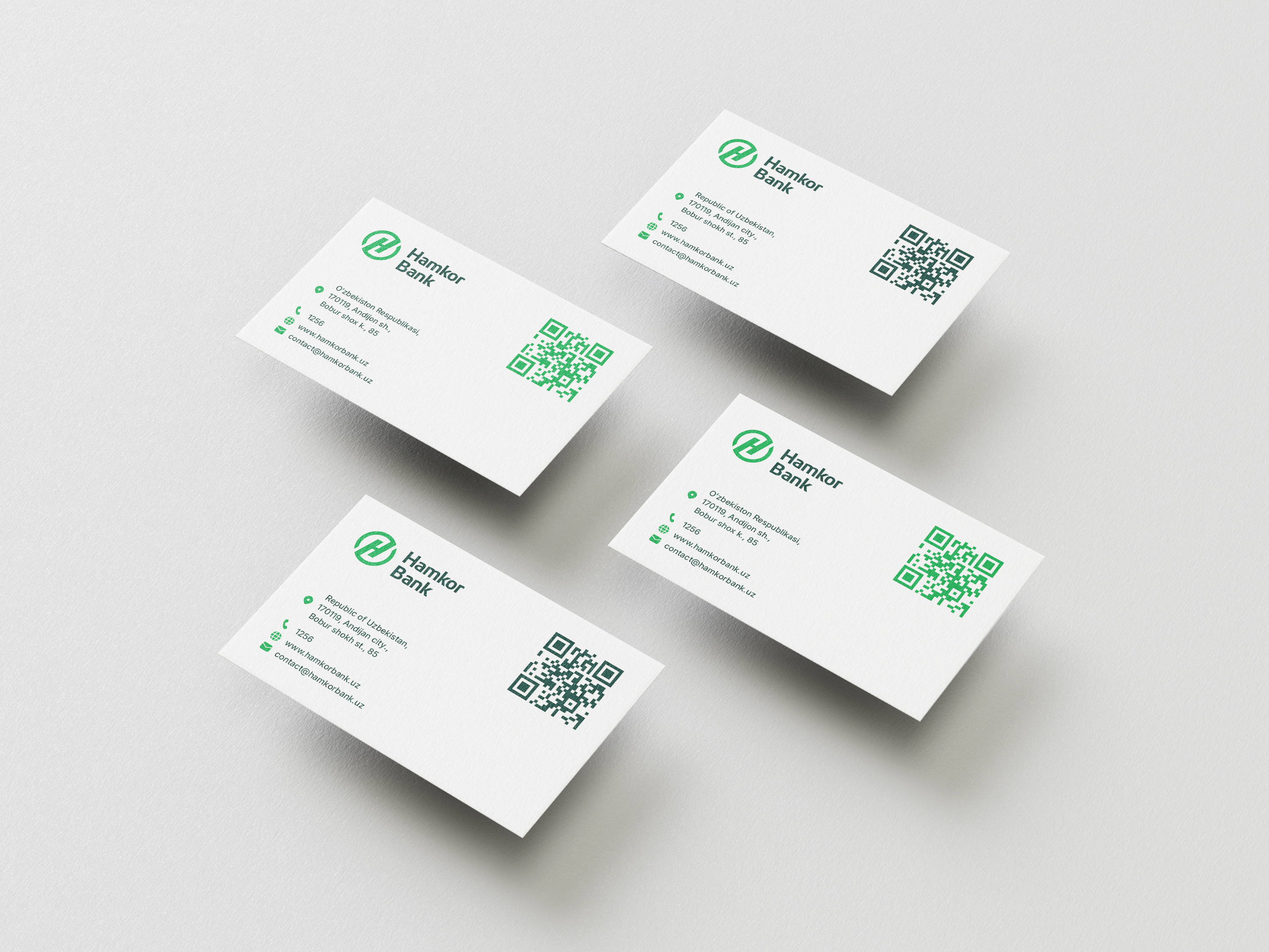
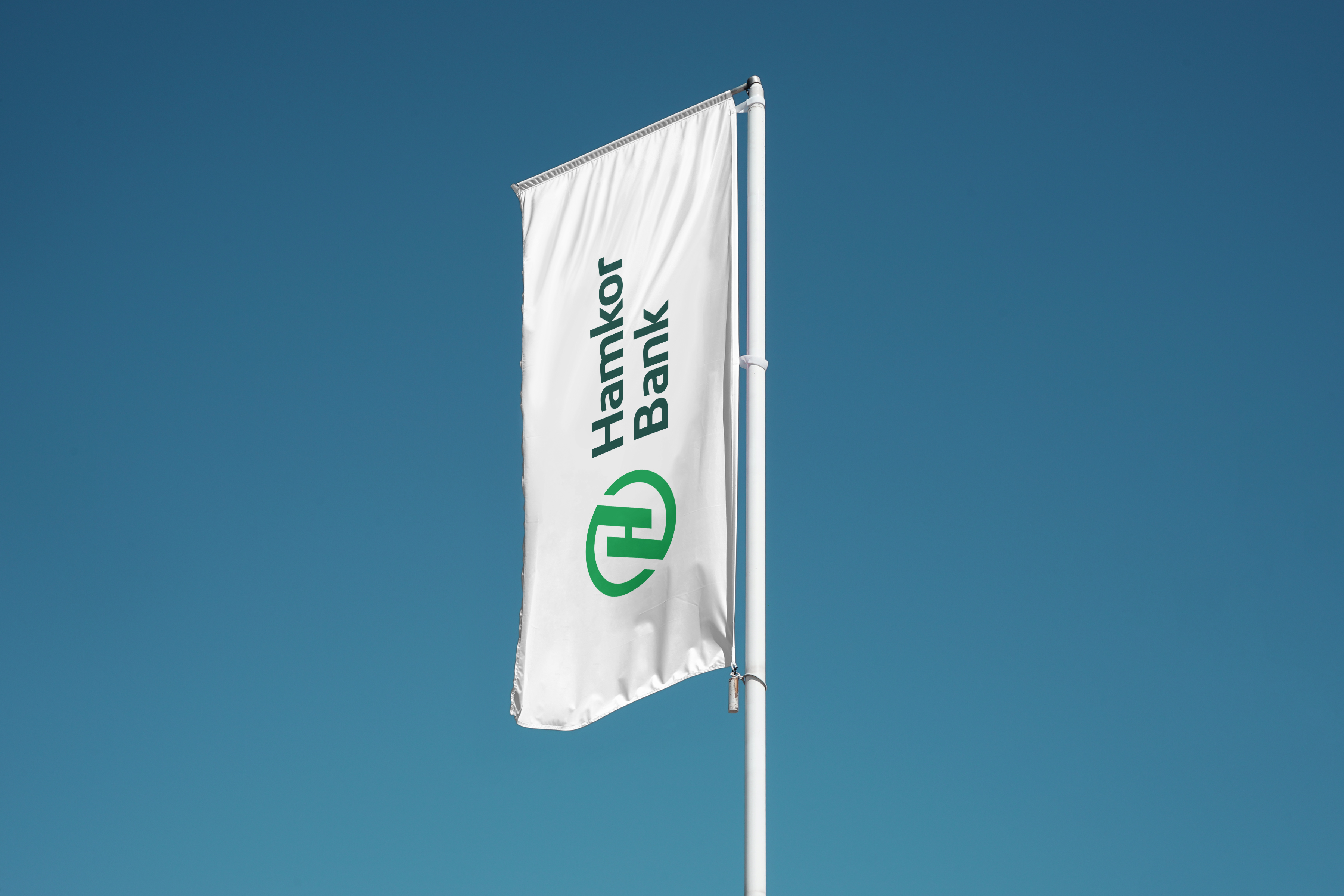
— the letter “H” placed inside a circle, symbolizing integrity, partnership, and synergy; — the “Hamkor Bank” name arranged on two levels, improving the logo’s flexibility and adaptability across different formats and communication channels.
As a result, the new logo addressed the key functional and communication challenges associated with the previous version.
🖌️ Visual Identity & Brand Book
After the new logo was approved, we moved on to developing a comprehensive brand book covering all key elements of the visual identity:
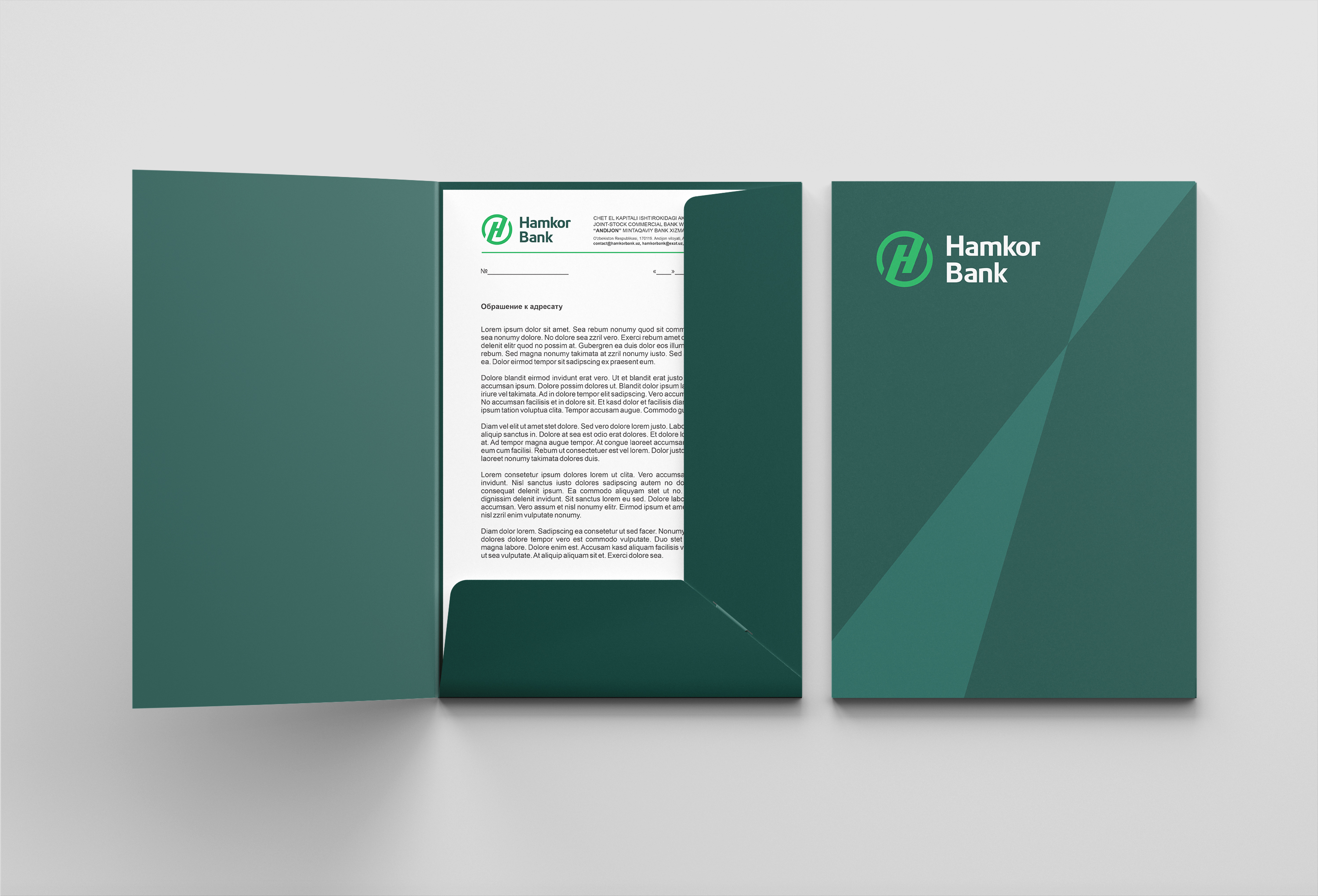
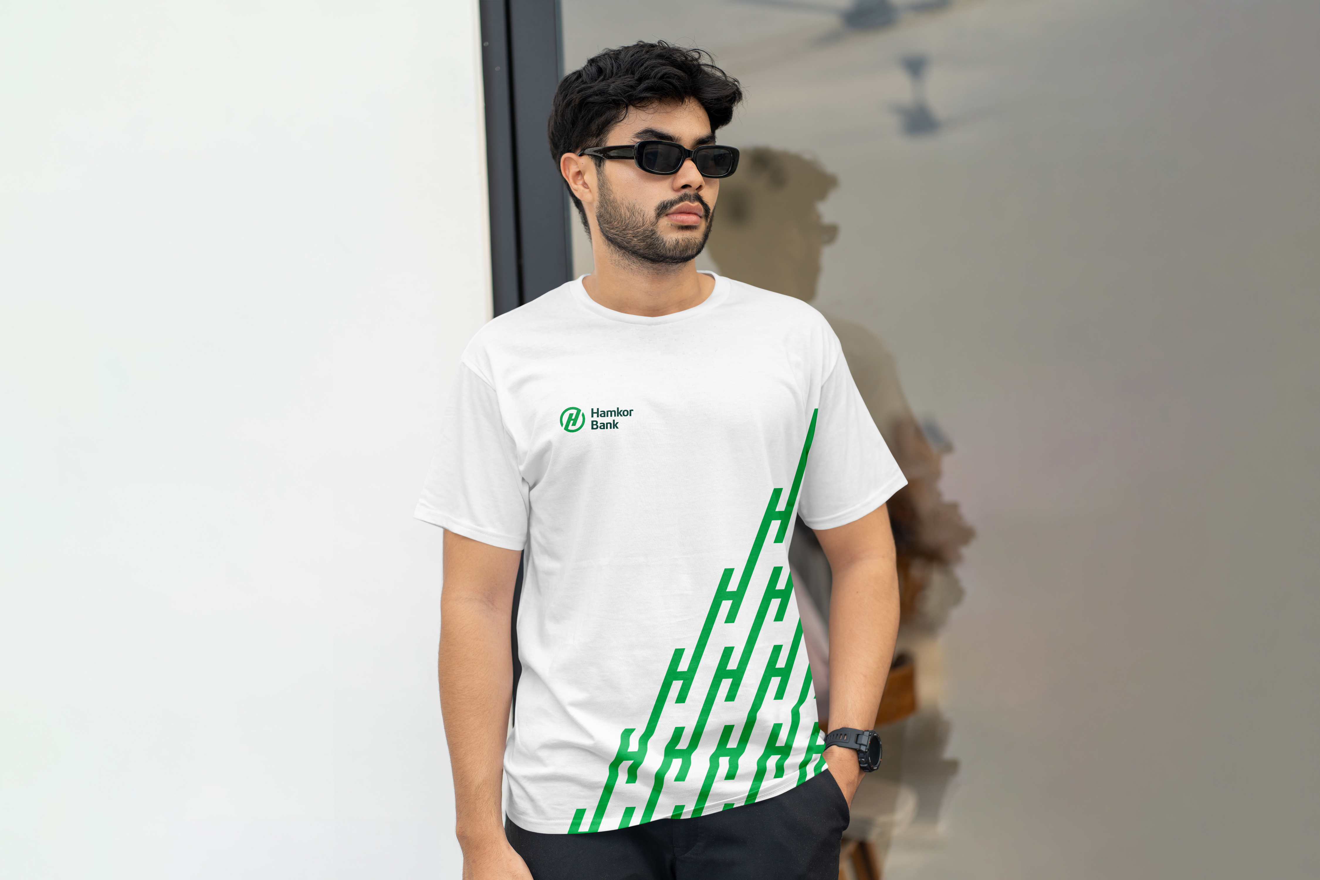
— an updated color palette; — modern and highly legible typography; — unique icons and graphic elements; — a unified photography style; — and a signature brand pattern developed from the letter “H”, representing visual partnership and brand consistency.
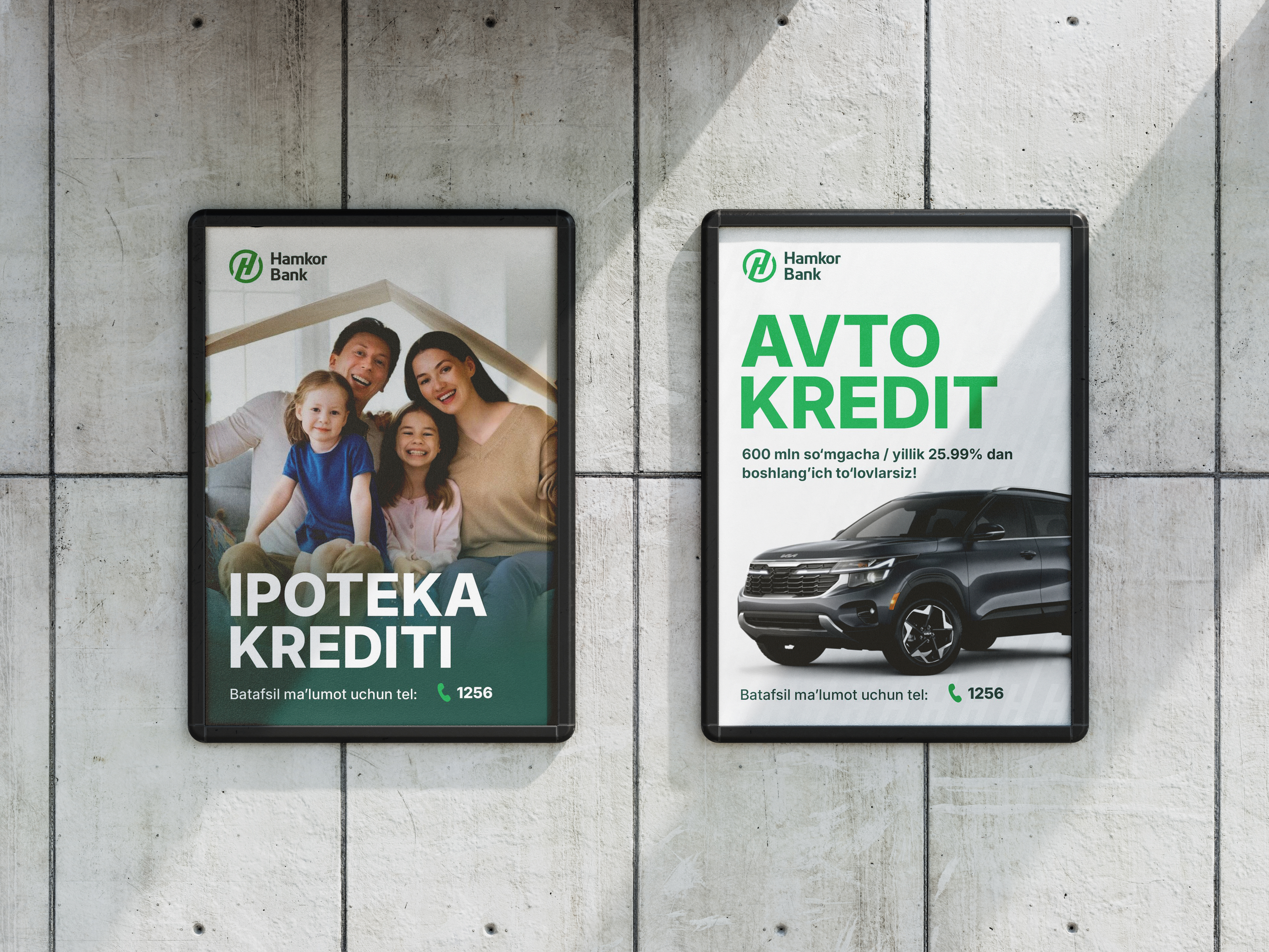
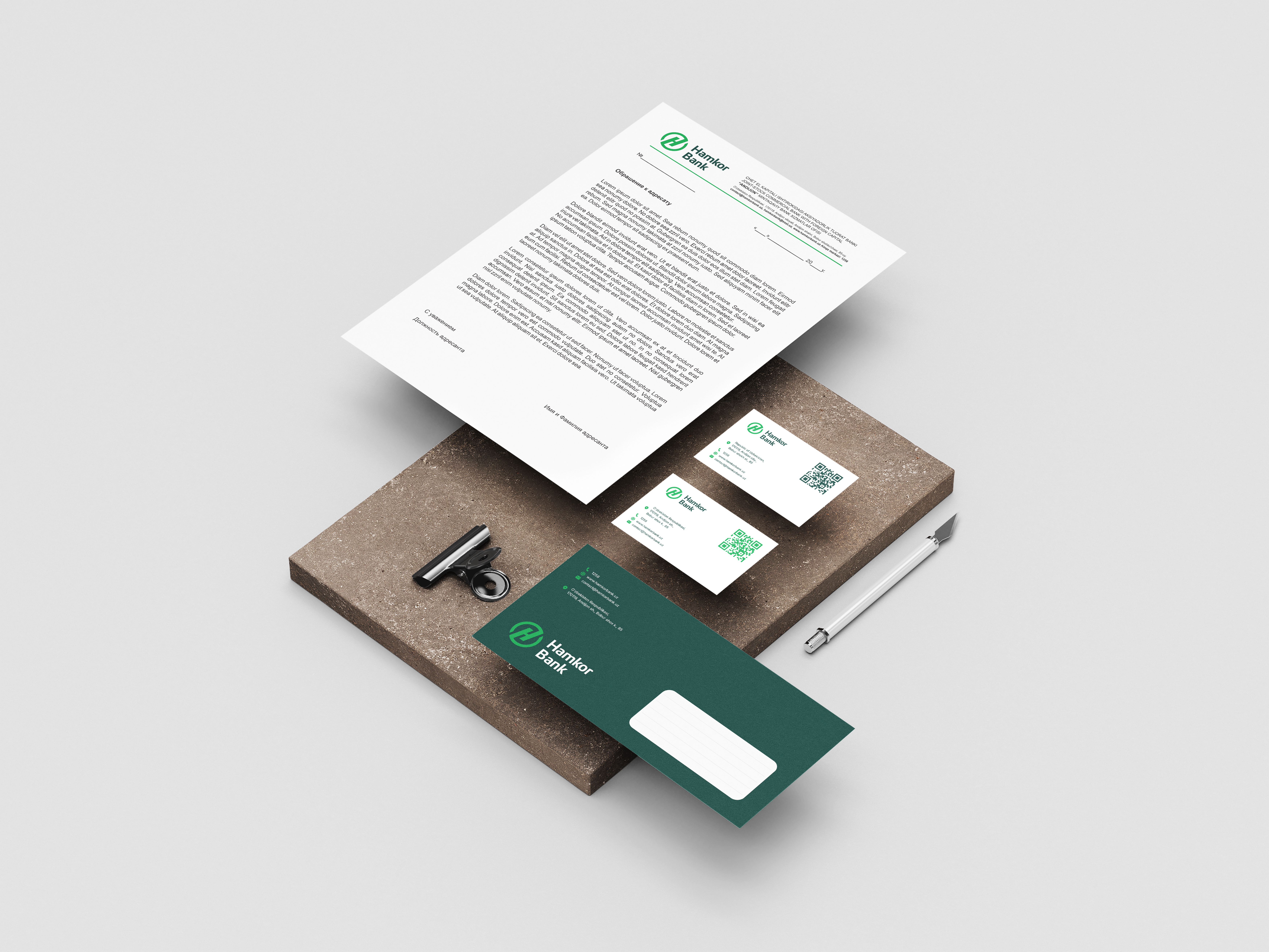
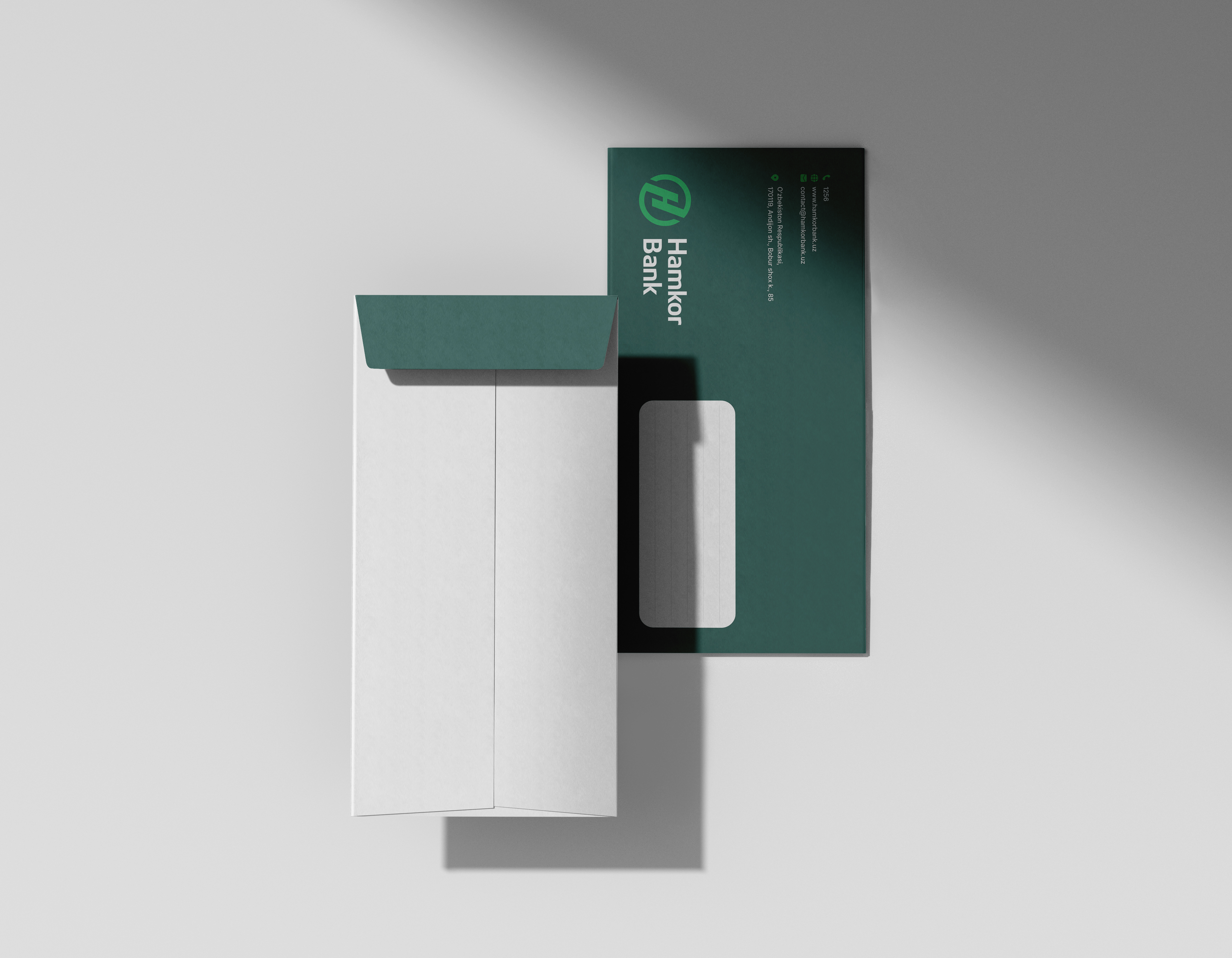
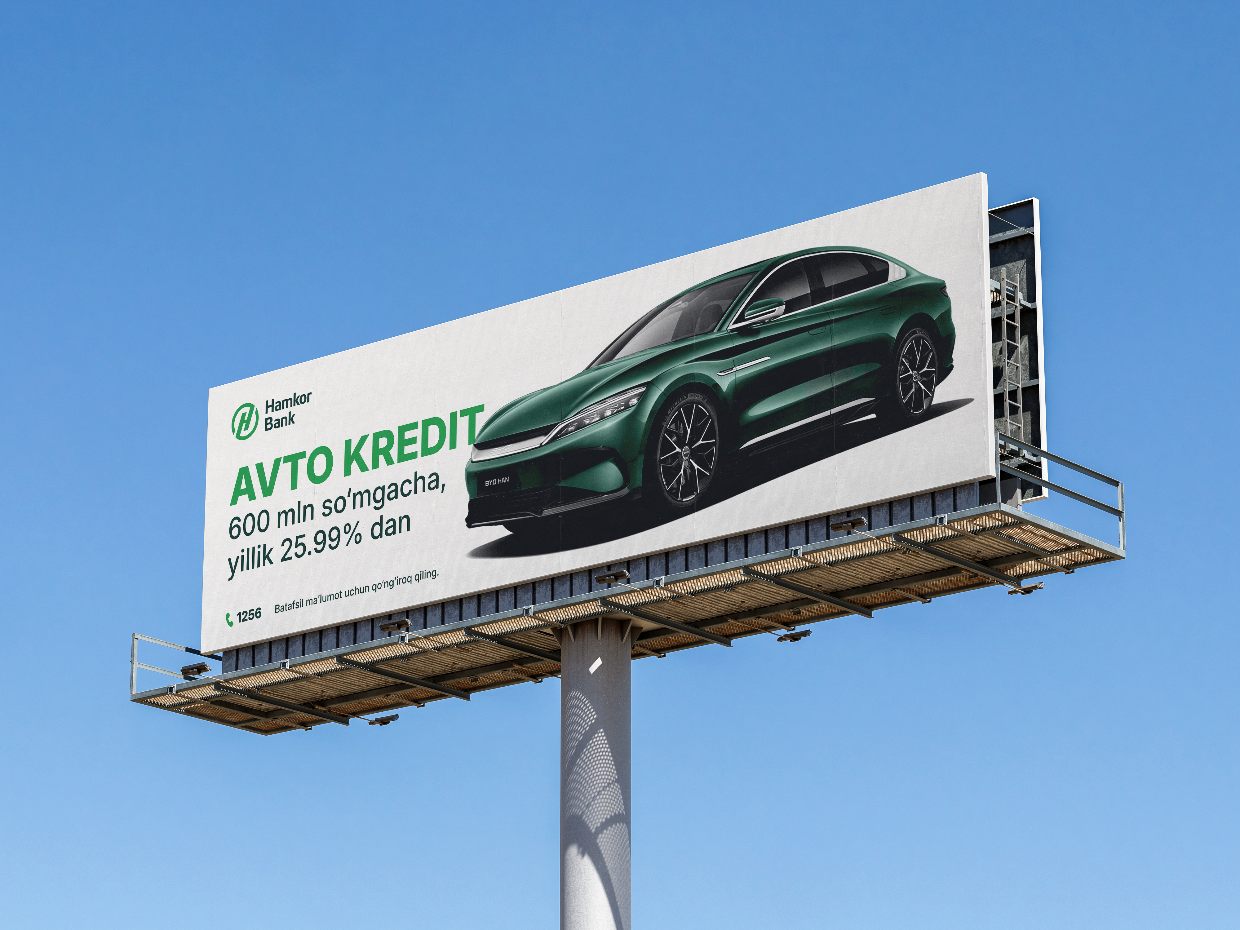
The entire visual system was structured into a detailed brand guideline, allowing the bank to easily scale and apply the new identity across all touchpoints — from digital channels to outdoor advertising.
✅ The Result
Hamkorbank is currently implementing its updated visual identity across Uzbekistan.
The bank has already begun:
— launching new communication campaigns based on its updated mission and values; — preparing for the launch of its innovative banking product, “Tezbank”; — fully updating advertising materials, signage, documentation, and digital platforms in accordance with the new brand book and unified visual identity.