
Client: Poytaxt Bank
Context: Re-Branding
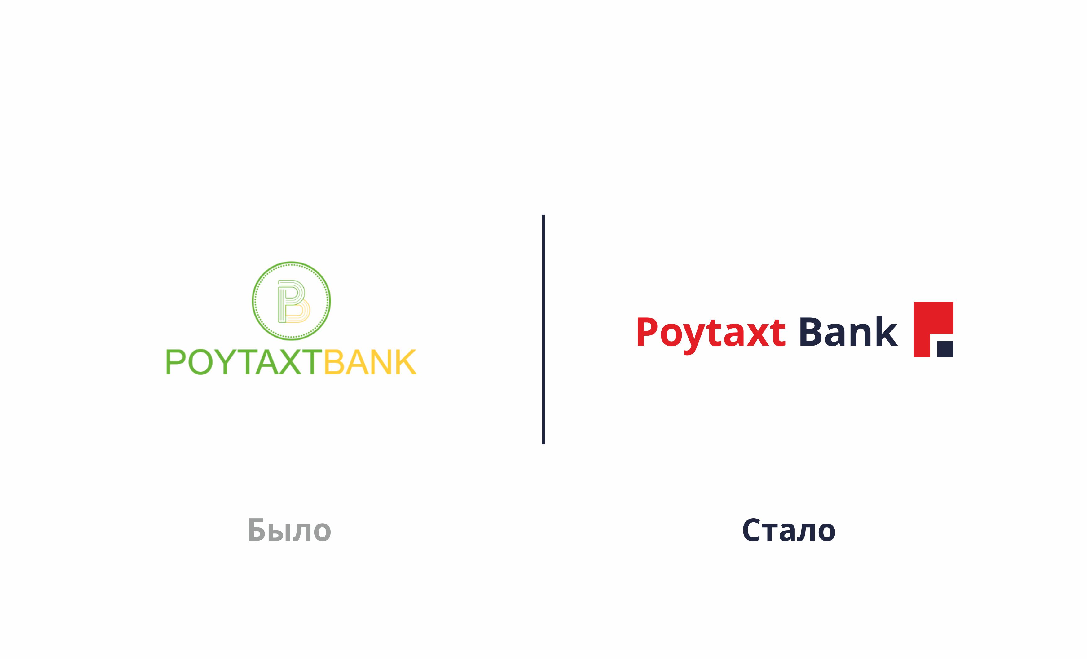
Task: The main challenge for the newly launched bank was not its services, but how the brand was perceived by potential customers. The existing logo and visual identity did not differentiate the bank strongly enough from other brands and failed to attract sufficient attention across outdoor and everyday communications. During research conducted among people in the area surrounding the bank, we found that approximately 54% of respondents did not notice the bank at all. This was more than a visual issue. Low brand awareness was affecting the likelihood of choosing the bank, customer trust, and ultimately its commercial performance. Therefore, our task was not simply to make the logo “look better”, but to turn the bank’s visual presence into a strong brand identity that supports real business objectives.
Solution: We deliberately avoided complex graphic metaphors and overly elaborate design solutions.
Instead, we created a simple, recognizable, and functional visual identity designed to work seamlessly across multiple communication channels.
The logo is built around two core colors:
Blue — representing trust, stability, and financial reliability; Red — representing energy, strength, and momentum.
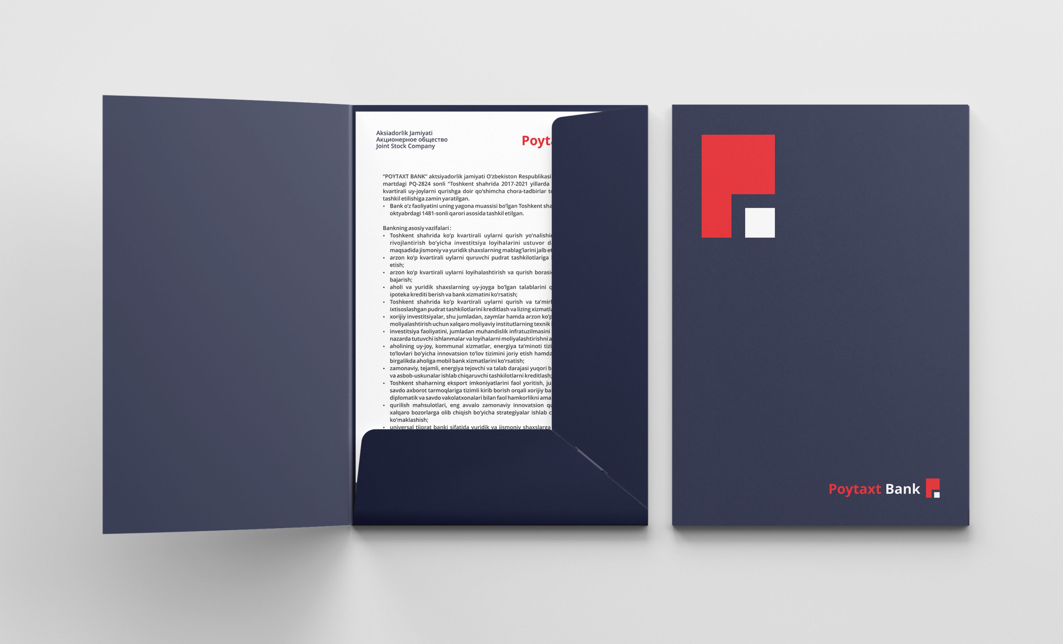
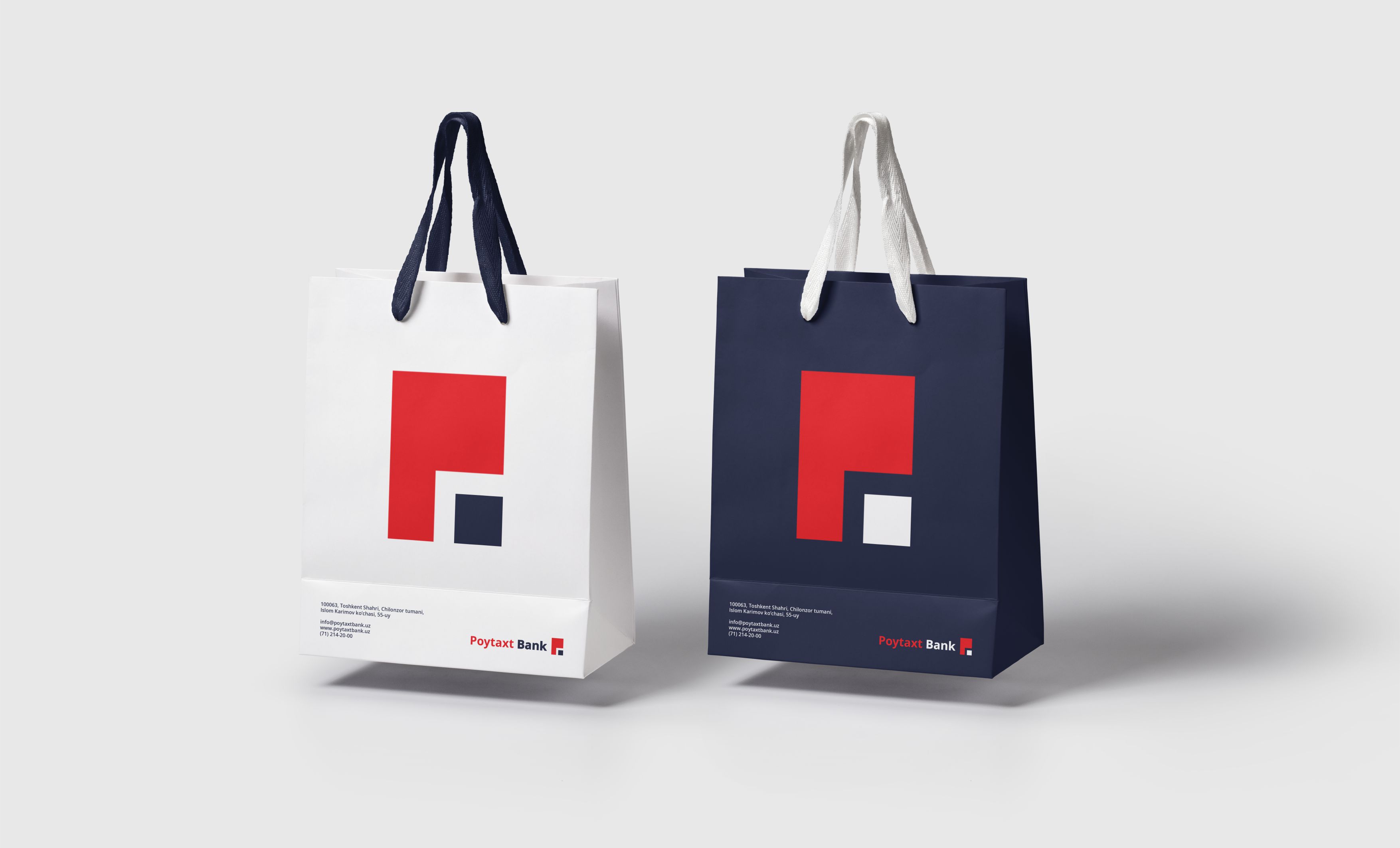
The symbol combines the letters “P” and “B” into a single form. The geometric rectangular shape references the meaning behind the name “POYTAXT” — the idea of a center, a city, and an urban environment.
However, the project went beyond the logo itself.
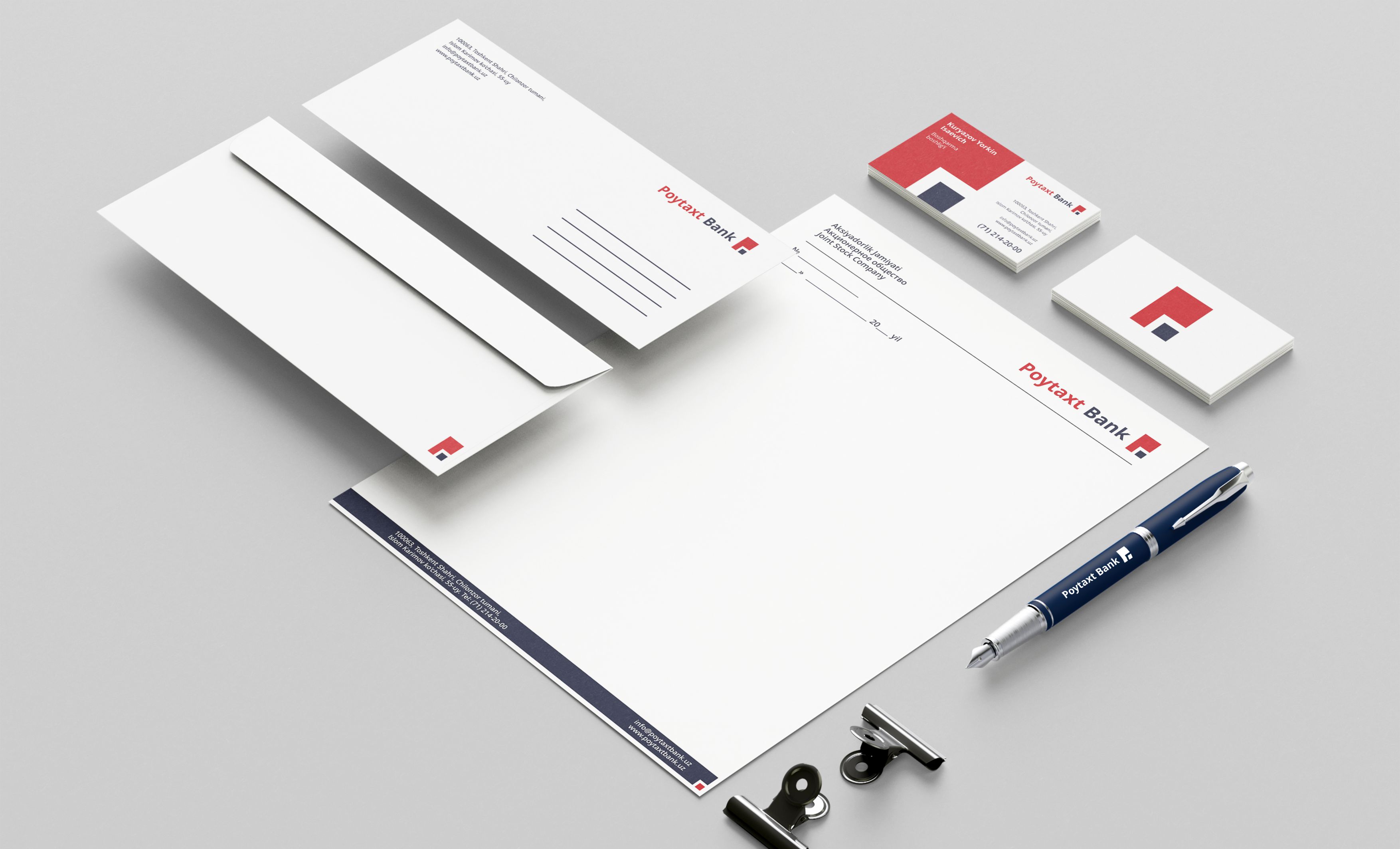
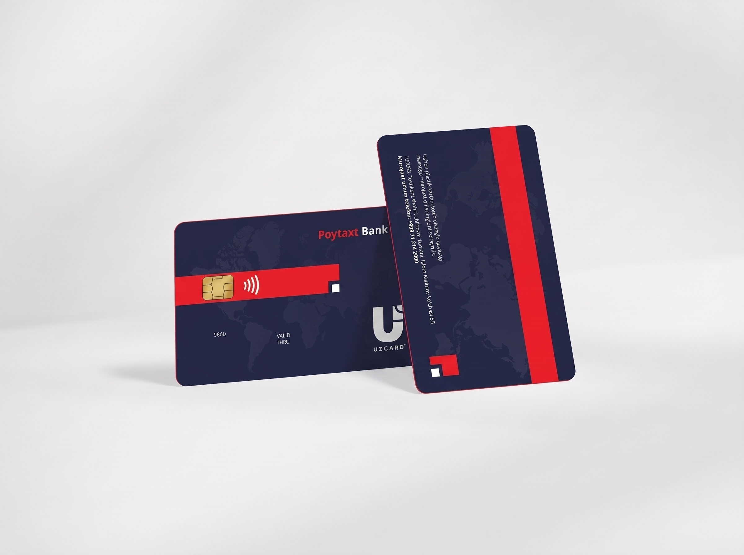
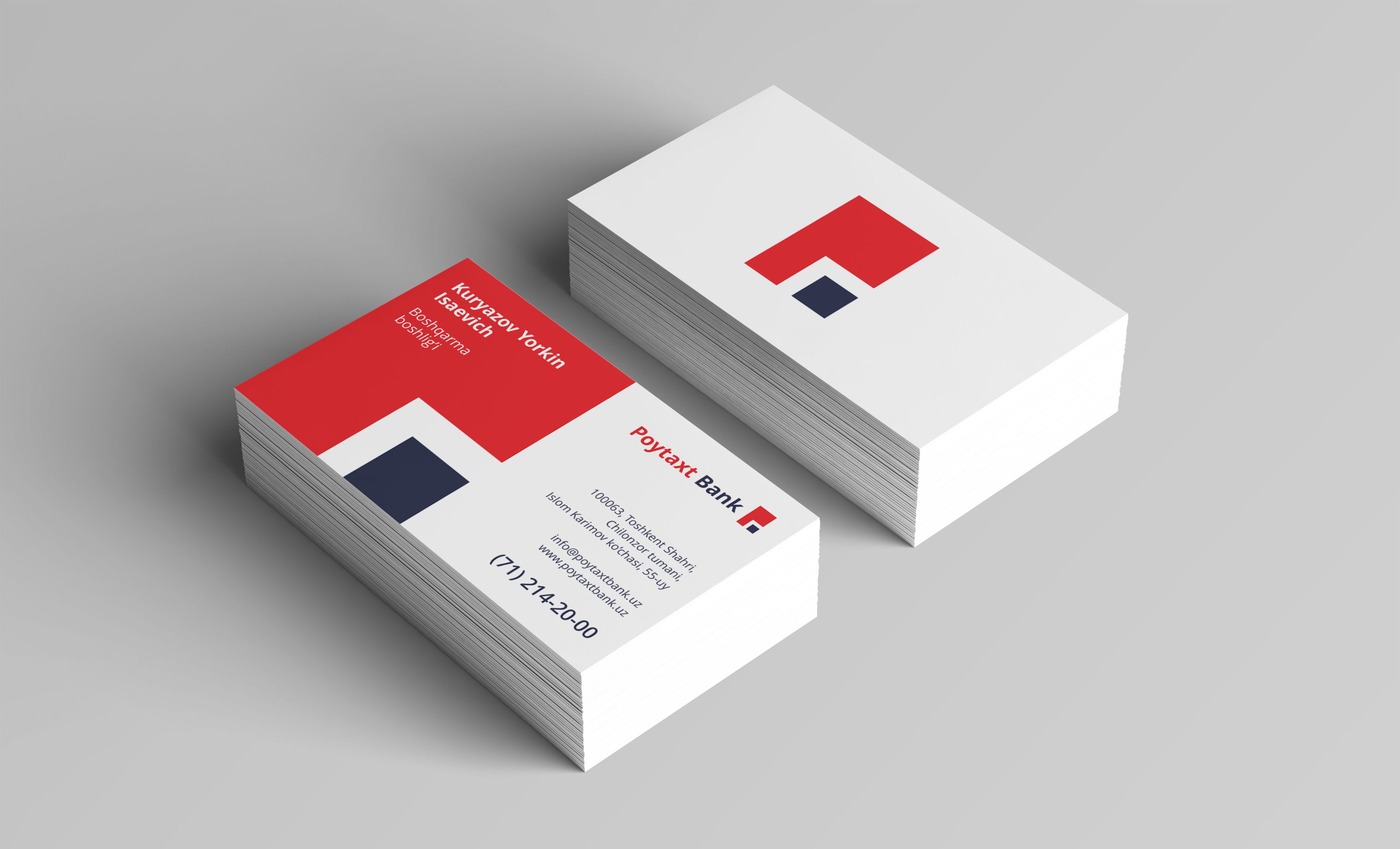
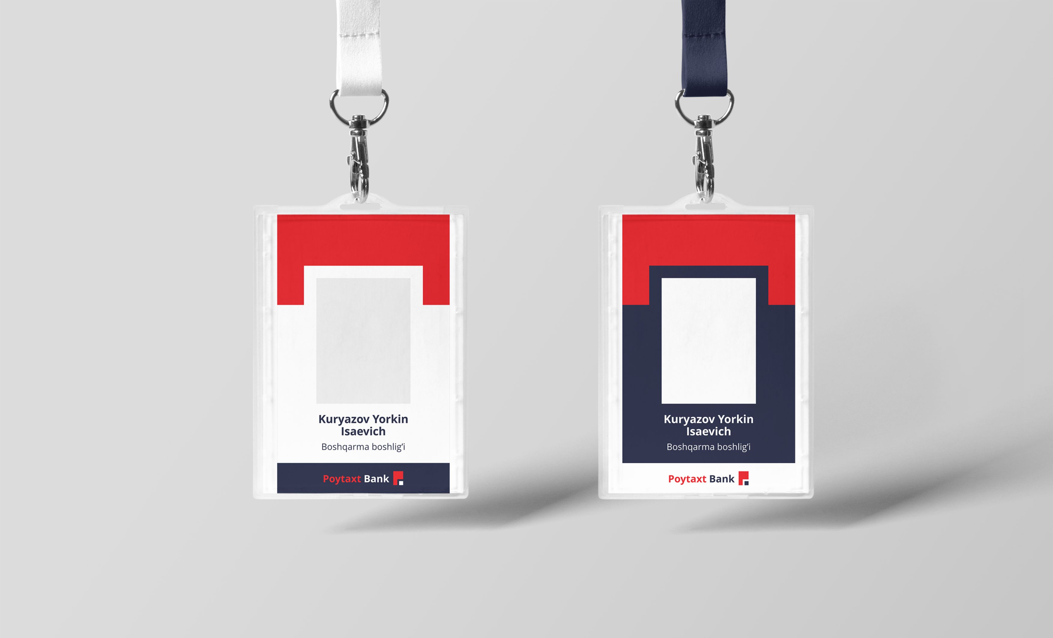
We developed a complete brand communication system that enables the new visual identity to be applied consistently across every customer touchpoint.
The goal was not simply to create a one-time visual refresh, but to build a cohesive brand experience through which customers could recognize and experience Poytaxt Bank consistently at every stage of interaction.
✅ The Result
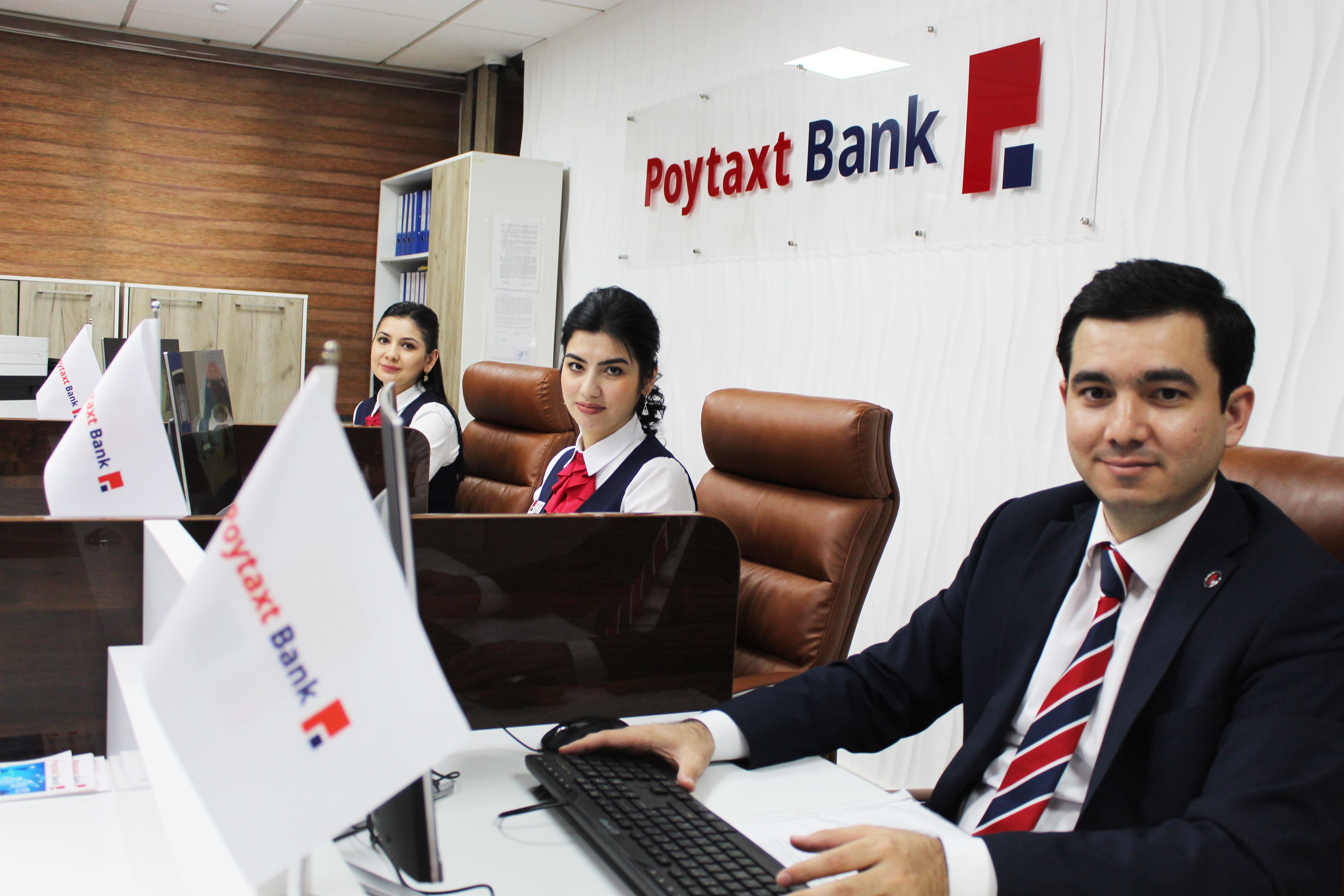
Following the rebranding, Poytaxt Bank gained a more distinctive, recognizable, and adaptable visual presence across different communication formats.
The new identity brought the bank’s services and communications together under one consistent visual language.
Post-rebranding customer research showed a steady increase in brand recognition.
The new identity therefore became more than a visual refresh for Poytaxt Bank — it became a brand asset designed to strengthen trust, capture customer attention, and support business growth.