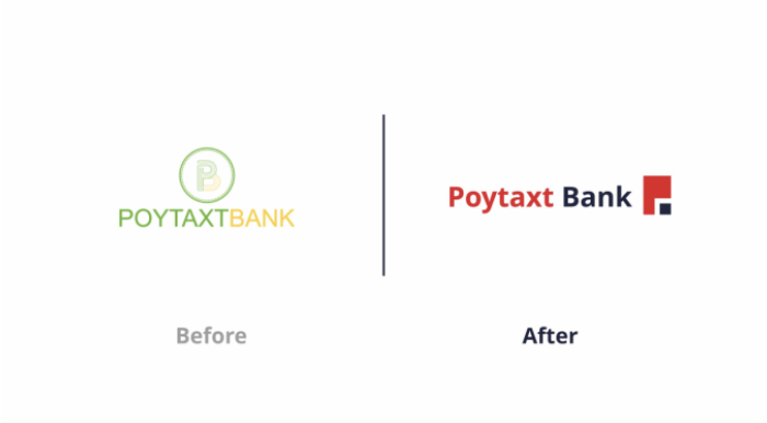
Client: Poytaxt Bank Web
Context: Website
Task: Develop a completely new brand packaging design in accordance with the new brand positioning. It was necessary to unite the products under one visual system and make them noticeable on the shelf.
Solution: We created a design concept based on the idea of shared joy.
The logo combines confidence and softness. Typography is both bold to be noticeable on the shelf, and without sharp corners to create a feeling of friendliness and softness.
Rich blue was chosen as a single brand color, providing recognition and good visibility on the shelf. We also used a convenient SKU differentiation system by color.
Special attention is drawn to the food zone. Concise but appetizing, it looks advantageous on bright packaging.